Early Beginnings
Cool Clash, a fighting game for the iPhone - man, it has been in the making for a long time and as I write this, I'm confident we'll submit it to Apple this month. This blog will shed some light on the process of making it.
While at a wedding on the East Coast, I met an old friend who showed me his iPhone and I recall the child-like fascination I had with the device - a touch screen, the App Store, swiping... he told me about a gun simulator app he had produced and he had many tens (maybe even hundreds) of thousands of downloads of this free app.
A month or so later, in the summer of 2009, I contacted a former colleague, Martin, whom I had met while working as a concept artist at a game company. Would he be interested in making an iPhone game?
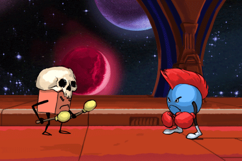
Very quickly we settled on a fighting game. I had played more hours of Soulcalibur than any other game during my college years and probably since - and a fighting game seemed like a thing we could do, in - say - half a year.
Yes, half a year. Little did we know...
Two characters punching and kicking, some parallax backgrounds - it should be simple enough.
For the first few months I thought - let's make robots, I'd build and animate them in Maya, top of the line 3D software I had been putting off learning for far too long - I had been freelancing as a 3ds Max guy in L.A. a few years back. I had left L.A. in part, because I was missing out on many gigs only knowing Max, not Maya.
The main reason was, however, that I wanted to do concept art - much more direct creative input.
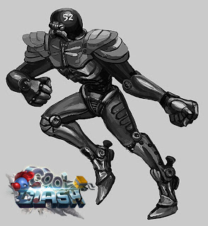 |
I like this football-robot design. Unless you use realtime 3D with zoomable
Camera, however, this fella's proportions wouldn't give you much to look at,
on a horizontally oriented iPhone screen. |
I don't recall exactly what caused me to change my mind, but it might have been the very fateful discovery of
Street Fighter 3rd Strike sprites on the internet. I was VERY impressed by those sprites - how smooth the animation was, how many individual frames of animation - 3 shades of darkness/lightness painted into each frame... this was a 2D-sprite-art-skill at the top level, refined over 10+ years - no way I could match that.
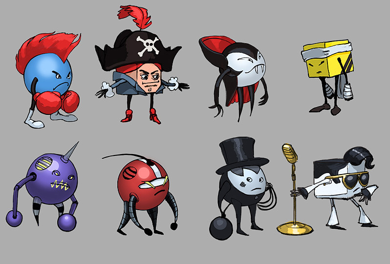
So I did some sketching and quickly came up with characters so simple, I thought it would be faster than detailed 3D characters converted to 2D sprites.
Spheres and cubes - that was going to be my design principle, my chosen design limitation.
The discovered beauty of
Street Fighter 3rd Strike encouraged me to abandon the 3D-route and go all 2D. Those excellent Street Fighter sprites had sparked my ambitions as an artist and I wanted to at least achieve respectable sprites. Super simple line-drawings with flat backgrounds - that wasn't going to cut it...
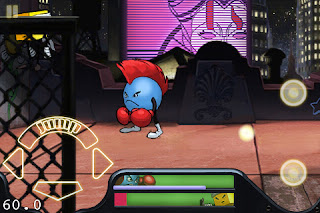
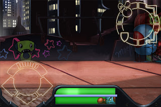
User Interface - many, many changes
Maybe the one aspect that took the longest to develop was the user interface. Early on we knew we wanted swipes for heavy attacks, but what would be a nice way of doing it?
Here you can get an idea of the amount of work that went in to it. Keep in mind, that most of these also had to be programmed by Martin to work in a test version - so this took much longer than just the time it took me to put it together from a graphics point of view.
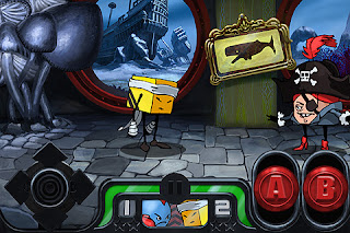
 |
| Here one of the earliest user interface designs for the game. We started out considering the possibility of virtual buttons - something we soon abandoned for the main combo-system in favor of sliders. |
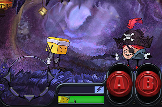
 |
"A" and "B" were now buttons you drag up and down. Also notice the
fancy dpad - arrows would pop out when pressed... |
 |
| JumpButton now an arc... |
 |
| JumpButton a nice large button - for dynamic jumps |
 |
| I think the idea here was to slide the little dot into the big areas |
 |
| Single slider. I like the look, but this also only lasted a few months at most... |
 |
| triangular design... |
The
two separate sliders for "A" and B" would have been fine and had we known how long it would take to keep changing things - I would not have told Martin of my
single-button-slider idea. But why should you have to let go of the slider - wouldn't it be more fun to keep pushing it around, like a joystick?
After about three years (yes, crazy) we landed at the final design...
 |
| This is where the journey led us - final UI elements |
Eventually I suggested to
get rid of the virtual slider all-together. You
swipe anywhere for heavy attacks (combos) and
tap the screen for quick attacks. The top right UI element serves as a reminder. You have four directions to swipe in:
- HeavyHighAttack
- HeavyLowAttack
- Throw
- Block
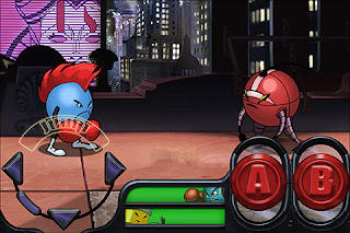
Dynamic Jump-System
Another thing you can notice: the Jump button. It was now a wide button and it would take into account where you press it! So about 2 years in to the project, the game's jumping now had
dynamic jumping, meaning the characters were not bound to one forward/backward angle, but had many degrees in-between.
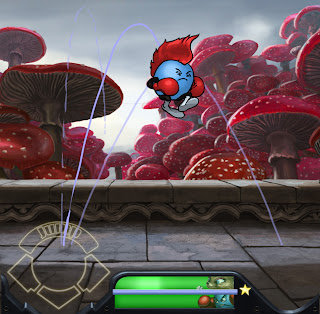 |
| Dynamic Jumping - allowing more freedom |
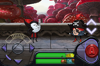
Character development
 |
| Early character designs. I like the chimney sweeper quite a bit. |
 |
| Maybe the earliest Photoshop character animation I did. |
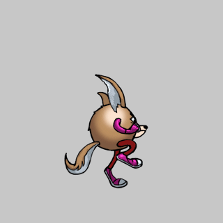 |
| Sticking too closely to the self-imposed design principle, that all characters had to be spheres or cubes... |
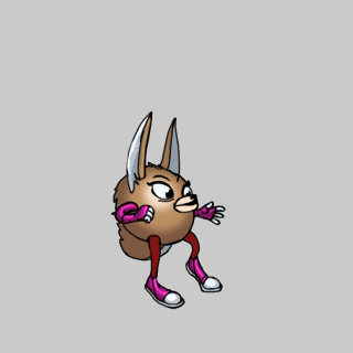 |
| Eventually I no longer was happy with the look of the female fox... |
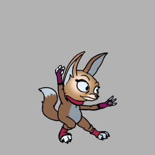 |
| I'm very glad I changed the look, even though it meant having to redo all her animations up to that point. |

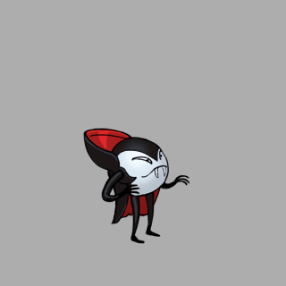 |
| Franz, the vampire. This is his final "idle" animation |
 |
An early animation, I didn't keep it in the game.
_______________________________________________________________
© 2013 Foxy Robot. All rights reserved. iPhone, iPad, & iPod touch are trademarks of Apple Inc. |


